
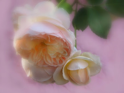
I don't think I like this one, but I am posting it anyway, after our discussion. I actually went out and laid a quilt behind the flowers (which unfortunately are starting to fade now), but you can see the wrinkles in the quilt, try as I might to smooth it both physically and in PS. I may try again. I Need to use a different lens. The one I used tends to be a bit wide angle and have too much depth of field. I was in a hurry because are losing our light for the day.
OK, I darkened the upper petals a little, but dunno if enough, and lightened and brightened the center of the rose a little. And slightly re-ortonized it.


10 comments:
LOL you did it! I do prefer this one definitely. In fact I prefer the angle so you can see the heart of the rose. Also with the pink background and the rose faded more it has made the colour of the rose more yellow and so the yellow and pink pastels look good together. I much prefer the composition. The only thing is that the brightness of the top lighter petals causes you to look away from the centre of the rose and maybe you could darken this bit down to draw our eyes into the rose. Tis beautiful. The wrinkles in the quilt are not a problem to me since I would not have known they were there unless you had said.
It looks better big.
Yeah, I could try that. I agree about the lighter petal drawing your eye away.
petals.
I was all set to try and follow your suggestion, but I just realized I did this on a different computer.
OK, I darkened the upper petals a little, but dunno if enough, and lightened and brightened the center of the rose a little. And slightly re-ortonized it.
I made it into a get well card for a sick friend.
I guess cos you used a different computer the upper petals don't look any darker to me. I still love it and what a wonderful get well card it would make.
Weird--they sure look darker on mine. Just scrolling up and down and looking at the two shows a significant difference on mine--monitors must be really different--oh well.
I made a get well card, a birthday card and a thinking of you card all from this image (thanks to you or I'd never have taken it at all)--and everyone I sent it to loved it.
I did NOT love it until I darkened the upper petals, lightened the center, etc. Now I like it, but I still don't really love it. (Because I can see what look like flaws to me.)
OK what I did was took both pics into photoshop and made them both exactly the same size. I can now see that the second one - the bottom one is darker in fact the upper petals have bits of pink in them instead of white or cream. Maybe I was a bit over the top to go to such great lengths but I couldn't see it until I did that. Now I CAN see the difference in the blog pics too. I think maybe I was thinking the top picture was the revised one but it is actually the bottom one that is revised. I do hope I am right.
I'm glad everybody loves it.
Oh dear! I am so sorry, I did not mean to create a problem for you!
Yes, it is the bottom one that I adjusted, lightening and brightening the center of the larger flower and darkening a little and coloring the upper petals.
It does look very nice as a card. :-D
I got a new phtoshop plug-in and am excited and can't wait to try it, it's called art rage--costs $25, First I have to get it installed and can't now, time for G's piano lesson.
It just came.
Post a Comment